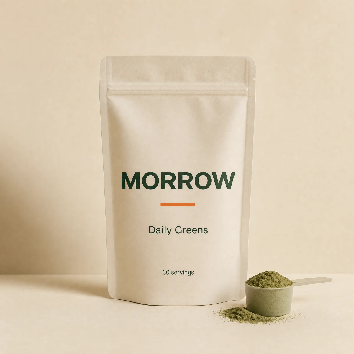
Split product hero
Headline and CTAs beside a product render, with a four-cell mono spec ledger.
blocksplitsupplementswellnesscta
$
npx shadcn@latest add @storekit/hero-splithero-split
Live and interactive. Switch the brand in the frame header to see the same source under another token file.
Installation
$
npx shadcn@latest add @storekit/hero-split$
pnpm dlx shadcn@latest add @storekit/hero-split$
yarn dlx shadcn@latest add @storekit/hero-split$
bunx --bun shadcn@latest add @storekit/hero-splitSource
components/storekit/hero/hero-split.tsx
114 lines
"use client"

import { motion, useReducedMotion } from "motion/react"
import { cn } from "@/components/storekit/lib/cn"
import { useSkBlock } from "@/components/storekit/lib/sk-analytics"

/* Split product hero. Headline, subcopy and a CTA pair on the left with a
   four-cell mono spec ledger; the product render fills a recessed panel on the
   right with a soft accent highlight washed over it. Stacks on mobile. */

const EASE = [0.23, 1, 0.32, 1] as const

type Cta = { label: string; href: string }
type Spec = { label: string; value: string; highlight?: boolean }

export function HeroSplit({
  eyebrow = "Daily wellness",
  headline = "One scoop. Your whole morning, handled.",
  subcopy = "Greens, adaptogens and probiotics that actually taste good. Third-party tested, made in the USA.",
  primaryCta = { label: "Shop Daily Greens", href: "#" },
  secondaryCta = { label: "See lab results", href: "#" },
  specs = [
    { label: "Servings", value: "30" },
    { label: "Per serving", value: "$1.63" },
    { label: "Sugar", value: "0g", highlight: true },
    { label: "Tested", value: "Every batch" },
  ],
  image = "/placeholder.webp",
  imageAlt = "Product render",
  className,
}: {
  eyebrow?: string
  headline?: string
  subcopy?: string
  primaryCta?: Cta
  secondaryCta?: Cta
  specs?: Spec[]
  image?: string
  imageAlt?: string
  className?: string
}) {
  const reduce = useReducedMotion()
  const sk = useSkBlock("hero", "hero-split")
  const rise = (i: number) => ({
    initial: { opacity: 0, y: reduce ? 0 : 8 },
    animate: { opacity: 1, y: 0 },
    transition: { duration: 0.45, ease: EASE, delay: reduce ? 0 : i * 0.06 },
  })

  return (
    <section ref={sk.ref} {...sk.attrs} className={cn("bg-sk-paper text-sk-ink", className)}>
      <div className="mx-auto grid w-full max-w-6xl items-center gap-10 px-4 py-12 sm:px-8 sm:py-16 lg:min-h-[480px] lg:grid-cols-2 lg:gap-16">
        <div className="order-2 lg:order-1">
          <motion.p {...rise(0)} className="font-sk-mono text-[11px] uppercase tracking-[0.14em] text-sk-muted">
            {eyebrow}
          </motion.p>
          <motion.h1
            {...rise(1)}
            className="mt-4 max-w-xl text-balance font-sk-display font-semibold leading-[1.1] tracking-[-0.02em]"
            style={{ fontSize: "clamp(2.25rem, 4.2vw, 3.25rem)" }}
          >
            {headline}
          </motion.h1>
          <motion.p {...rise(2)} className="mt-5 max-w-md text-[15px] leading-[1.5] text-sk-muted">
            {subcopy}
          </motion.p>
          <motion.div {...rise(3)} className="mt-8 flex flex-col gap-3 sm:flex-row">
            <a
              href={primaryCta.href}
              onClick={() => sk.emit("interact", "cta")}
              className="sk-btn inline-flex min-h-12 items-center justify-center py-2.5 text-center leading-tight rounded-sk-btn bg-sk-accent px-7 text-[15px] font-medium text-sk-accent-ink outline-none transition-[filter,transform] duration-200 ease-sk-out hover:brightness-[1.06] focus-visible:ring-2 focus-visible:ring-sk-accent focus-visible:ring-offset-2 focus-visible:ring-offset-sk-paper active:scale-[0.97]"
            >
              {primaryCta.label}
            </a>
            <a
              href={secondaryCta.href}
              onClick={() => sk.emit("interact", "cta_secondary")}
              className="sk-btn inline-flex min-h-12 items-center justify-center py-2.5 text-center leading-tight rounded-sk-btn border border-sk-line px-7 text-[15px] font-medium text-sk-ink outline-none transition-[background-color,transform] duration-200 ease-sk-out hover:bg-sk-ink/[0.04] focus-visible:ring-2 focus-visible:ring-sk-accent focus-visible:ring-offset-2 focus-visible:ring-offset-sk-paper active:scale-[0.97]"
            >
              {secondaryCta.label}
            </a>
          </motion.div>
          <motion.dl
            {...rise(4)}
            className="mt-10 grid grid-cols-2 gap-px overflow-hidden rounded-sk-card border border-sk-line bg-sk-line sm:grid-cols-4"
          >
            {specs.map((s) => (
              <div key={s.label} className="flex flex-col gap-1 bg-sk-paper px-4 py-3">
                <dt className="font-sk-mono text-[11px] uppercase tracking-[0.14em] text-sk-muted">{s.label}</dt>
                <dd className={cn("font-sk-mono text-[15px] tabular-nums", s.highlight ? "text-sk-accent" : "text-sk-ink")}>
                  {s.value}
                </dd>
              </div>
            ))}
          </motion.dl>
        </div>

        <motion.div
          initial={{ opacity: 0, scale: reduce ? 1 : 0.95 }}
          animate={{ opacity: 1, scale: 1 }}
          transition={{ duration: 0.5, ease: EASE, delay: reduce ? 0 : 0.1 }}
          className="relative order-1 aspect-square overflow-hidden rounded-sk-card border border-sk-line bg-sk-surface sm:aspect-[5/4] lg:order-2 lg:aspect-[4/5]"
        >
          <img src={image} alt={imageAlt} className="absolute inset-0 h-full w-full object-cover" />
          <div
            aria-hidden
            className="pointer-events-none absolute inset-0 bg-[radial-gradient(circle_at_50%_45%,rgb(var(--sk-accent)/0.12),transparent_65%)]"
          />
        </motion.div>
      </div>
    </section>
  )
}
Usage
Import from "@/components/storekit/hero/hero-split" and pass your product data. The demo above exercises the full prop surface with sample values.