 #1
Best-seller shelf hero
Store rating headline over the top products with rank badges, stars, price and quick add; scrolls sideways with a peek on mobile.
blockbestseller-shelfanyatc
$
npx shadcn@latest add @storekit/hero-bestseller-shelfhero-bestseller-shelf
Live and interactive. Switch the brand in the frame header to see the same source under another token file.
Installation
$
npx shadcn@latest add @storekit/hero-bestseller-shelf$
pnpm dlx shadcn@latest add @storekit/hero-bestseller-shelf$
yarn dlx shadcn@latest add @storekit/hero-bestseller-shelf$
bunx --bun shadcn@latest add @storekit/hero-bestseller-shelfSource
components/storekit/hero/hero-bestseller-shelf.tsx
160 lines
"use client"

import { useState } from "react"
import { AnimatePresence, motion, useReducedMotion } from "motion/react"
import { Check, Plus } from "lucide-react"
import { cn } from "@/components/storekit/lib/cn"
import { useSkBlock } from "@/components/storekit/lib/sk-analytics"
import { Price } from "@/components/storekit/ui/price"
import { Stars } from "@/components/storekit/ui/stars"
import { Badge } from "@/components/storekit/ui/badge"

/* Best-seller shelf as the hero. A short headline with store-wide rating,
   then the top products above the fold with image, rating, price and a
   quick add that confirms in place. Four cards on desktop; on mobile the
   shelf scrolls sideways with the next card peeking so it reads as more.
   Rank badges call out the top sellers. */

const EASE = [0.23, 1, 0.32, 1] as const

export type ShelfProduct = {
  id: string
  title: string
  href: string
  image: string
  price: number
  compareAt?: number
  rating?: number
  reviews?: number
  blurb?: string
}

const SAMPLE: ShelfProduct[] = [
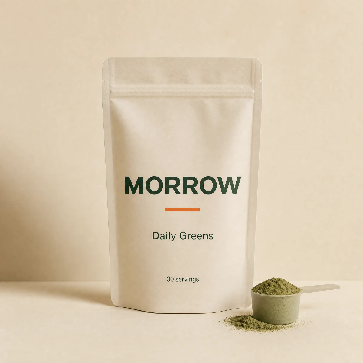
  { id: "1", title: "Daily Greens", href: "#", image: "/placeholder.webp", price: 4900, compareAt: 5900, rating: 4.8, reviews: 2140 },
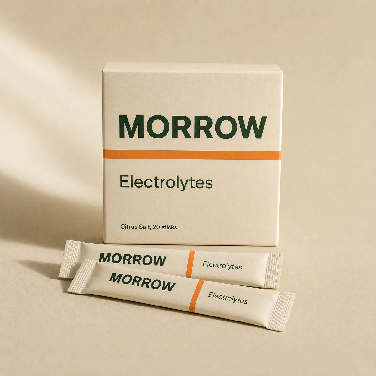
  { id: "2", title: "Electrolytes", href: "#", image: "/placeholder.webp", price: 3200, rating: 4.7, reviews: 980 },
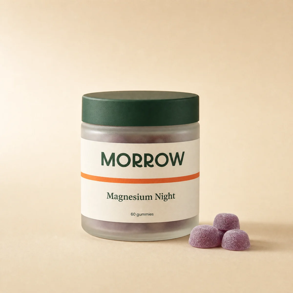
  { id: "3", title: "Magnesium Night", href: "#", image: "/placeholder.webp", price: 2900, rating: 4.9, reviews: 1630 },
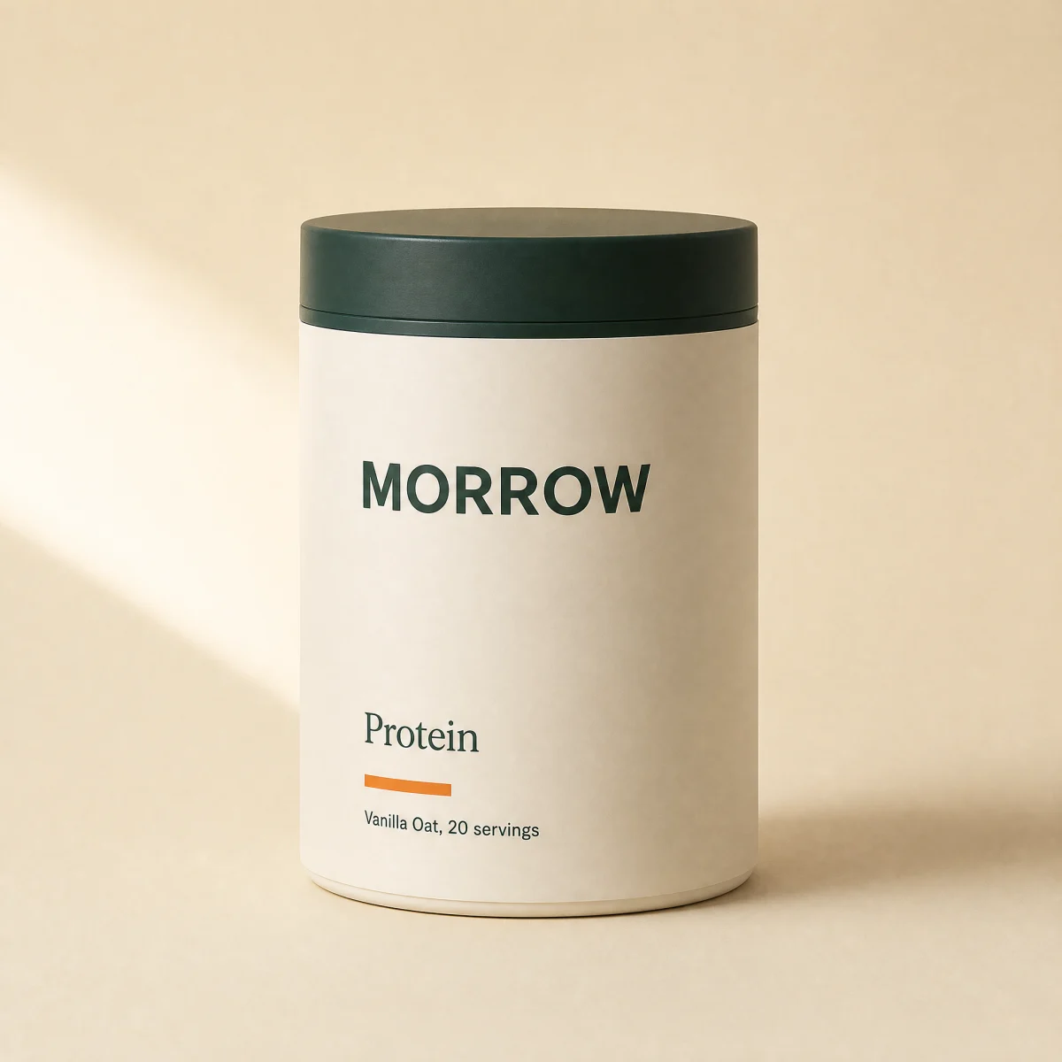
  { id: "4", title: "Protein", href: "#", image: "/placeholder.webp", price: 5400, rating: 4.6, reviews: 720 },
]

export function HeroBestsellerShelf({
  eyebrow = "Best sellers",
  headline = "What everyone is restocking.",
  rating = { value: 4.8, count: 12400 },
  link = { label: "Shop all best sellers", href: "#" },
  products = SAMPLE,
  ranked = true,
  onAdd,
  className,
}: {
  eyebrow?: string
  headline?: string
  rating?: { value: number; count: number } | null
  link?: { label: string; href: string } | null
  products?: ShelfProduct[]
  /** Show "#1, #2..." badges. */
  ranked?: boolean
  onAdd?: (id: string) => void
  className?: string
}) {
  const reduce = useReducedMotion()
  const sk = useSkBlock("hero", "hero-bestseller-shelf")
  const [added, setAdded] = useState<Record<string, boolean>>({})

  const add = (p: ShelfProduct, i: number) => {
    onAdd?.(p.id)
    setAdded((a) => ({ ...a, [p.id]: true }))
    sk.emit("convert", "add_to_cart", i)
  }

  return (
    <section ref={sk.ref} {...sk.attrs} className={cn("bg-sk-paper text-sk-ink", className)}>
      <div className="mx-auto w-full max-w-6xl py-10 sm:py-14">
        <div className="flex flex-col gap-3 px-4 sm:flex-row sm:items-end sm:justify-between sm:px-8">
          <div>
            <p className="font-sk-mono text-[11px] uppercase tracking-[0.14em] text-sk-muted">{eyebrow}</p>
            <h1 className="mt-3 text-balance font-sk-display font-semibold leading-[1.08] tracking-[-0.02em]" style={{ fontSize: "clamp(1.85rem, 3.6vw, 2.75rem)" }}>
              {headline}
            </h1>
            {rating ? (
              <p className="mt-3 flex items-center gap-2 text-sm text-sk-muted">
                <Stars value={rating.value} size={14} />
                <span>
                  <span className="font-medium text-sk-ink tabular-nums">{rating.value.toFixed(1)}</span> from {rating.count.toLocaleString("en-US")} reviews
                </span>
              </p>
            ) : null}
          </div>
          {link ? (
            <a
              href={link.href}
              onClick={() => sk.emit("interact", "shop_all")}
              className="inline-flex min-h-11 shrink-0 items-center self-start text-sm font-medium underline decoration-sk-line underline-offset-4 outline-none transition-[text-decoration-color] hover:decoration-sk-ink focus-visible:ring-2 focus-visible:ring-sk-accent sm:self-auto"
            >
              {link.label}
            </a>
          ) : null}
        </div>

        <ul className="mt-6 flex snap-x snap-mandatory gap-3 overflow-x-auto scroll-px-4 px-4 pb-2 [scrollbar-width:none] sm:scroll-px-8 sm:px-8 lg:grid lg:grid-cols-4 lg:gap-4 lg:overflow-visible">
          {products.map((p, i) => {
            const done = added[p.id]
            return (
              <motion.li
                key={p.id}
                initial={{ opacity: 0, y: reduce ? 0 : 12 }}
                animate={{ opacity: 1, y: 0 }}
                transition={{ duration: 0.5, ease: EASE, delay: reduce ? 0 : i * 0.06 }}
                className="w-[68%] shrink-0 snap-start sm:w-[40%] lg:w-auto"
              >
                <article className="group flex h-full flex-col overflow-hidden rounded-sk-card border border-sk-line bg-sk-card">
                  <a href={p.href} onClick={() => sk.emit("interact", "product", i)} className="relative block aspect-square overflow-hidden bg-sk-surface outline-none focus-visible:ring-2 focus-visible:ring-inset focus-visible:ring-sk-accent">
                    <img src={p.image} alt={p.title} className="absolute inset-0 h-full w-full object-cover transition-transform duration-700 ease-sk-out group-hover:scale-[1.04]" />
                    {ranked ? (
                      <span className="absolute left-2.5 top-2.5">
                        <Badge tone={i === 0 ? "accent" : "neutral"}>#{i + 1}</Badge>
                      </span>
                    ) : null}
                  </a>
                  <div className="flex flex-1 flex-col p-3 sm:p-4">
                    <h2 className="text-[15px] font-semibold leading-tight">
                      <a href={p.href} className="outline-none hover:underline focus-visible:underline">
                        {p.title}
                      </a>
                    </h2>
                    {typeof p.rating === "number" ? <Stars value={p.rating} count={p.reviews} size={12} className="mt-1.5 [&>span]:text-[12px]" /> : null}
                    <div className="mt-auto flex items-center justify-between gap-2 pt-3">
                      <Price amount={p.price} compareAt={p.compareAt} size="sm" />
                      <button
                        type="button"
                        onClick={() => add(p, i)}
                        aria-label={done ? `${p.title} added to cart` : `Add ${p.title} to cart`}
                        className={cn(
                          "sk-btn relative grid h-10 w-10 shrink-0 place-items-center overflow-hidden rounded-full outline-none transition-[background-color,color,transform] duration-200 ease-sk-out focus-visible:ring-2 focus-visible:ring-sk-accent focus-visible:ring-offset-2 focus-visible:ring-offset-sk-card active:scale-[0.92]",
                          done ? "bg-sk-savings text-sk-paper" : "bg-sk-accent text-sk-accent-ink hover:brightness-[1.06]"
                        )}
                      >
                        <AnimatePresence initial={false} mode="popLayout">
                          <motion.span
                            key={done ? "done" : "add"}
                            initial={{ y: reduce ? 0 : 14, opacity: 0 }}
                            animate={{ y: 0, opacity: 1 }}
                            exit={{ y: reduce ? 0 : -14, opacity: 0 }}
                            transition={{ type: "spring", stiffness: 520, damping: 32 }}
                            className="grid place-items-center"
                          >
                            {done ? <Check size={16} aria-hidden /> : <Plus size={16} aria-hidden />}
                          </motion.span>
                        </AnimatePresence>
                      </button>
                    </div>
                  </div>
                </article>
              </motion.li>
            )
          })}
        </ul>
      </div>
    </section>
  )
}
Usage
Wire `onAdd` to your cart; each add fires a convert event.