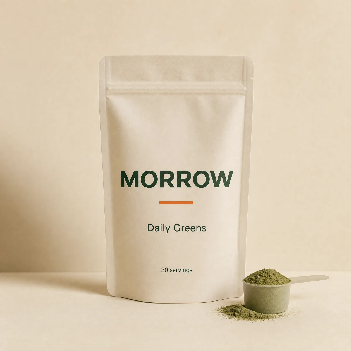
Dropdown stack
Numbered native selects with label and value always visible, sequential unlock, price deltas and a running total.
componentdropdownanyvariants
$
npx shadcn@latest add @storekit/pdp-dropdown-stackpdp-dropdown-stack
Live and interactive. Switch the brand in the frame header to see the same source under another token file.
Installation
$
npx shadcn@latest add @storekit/pdp-dropdown-stack$
pnpm dlx shadcn@latest add @storekit/pdp-dropdown-stack$
yarn dlx shadcn@latest add @storekit/pdp-dropdown-stack$
bunx --bun shadcn@latest add @storekit/pdp-dropdown-stackSource
components/storekit/pdp/pdp-dropdown-stack.tsx
156 lines
"use client"

import { useId, useState } from "react"
import { AnimatePresence, motion, useReducedMotion } from "motion/react"
import { Check, ChevronDown } from "lucide-react"
import { cn, money } from "@/components/storekit/lib/cn"
import { useSkBlock } from "@/components/storekit/lib/sk-analytics"

/* Structured dropdown stack for long option sets. Each step is a numbered
   field whose label and current value are always visible; the native select
   sits on top, invisible, so every platform gets its own picker and full
   keyboard support. Later steps unlock once the earlier ones have a value.
   Price deltas are integer cents and roll into the running total. */

type Choice = { value: string; label: string; delta?: number; disabled?: boolean }
type Field = { id: string; label: string; options: Choice[] }

const EASE = [0.16, 1, 0.3, 1] as const

const DEFAULT_FIELDS: Field[] = [
  {
    id: "flavor",
    label: "Flavor",
    options: [
      { value: "original", label: "Original" },
      { value: "pineapple", label: "Pineapple mint" },
      { value: "berry", label: "Wild berry", delta: 300 },
    ],
  },
  {
    id: "count",
    label: "Size",
    options: [
      { value: "1", label: "30 servings" },
      { value: "2", label: "60 servings", delta: 4000 },
      { value: "3", label: "3-pouch bundle", delta: 8000 },
    ],
  },
  {
    id: "shaker",
    label: "Add a shaker",
    options: [
      { value: "none", label: "None" },
      { value: "glass", label: "Glass shaker", delta: 1200 },
      { value: "steel", label: "Steel shaker", delta: 1800, disabled: true },
    ],
  },
]

export function PdpDropdownStack({
  fields = DEFAULT_FIELDS,
  basePrice = 5900,
  defaultValues = {},
  onChange,
  className,
}: {
  fields?: Field[]
  /** Price before any option deltas, integer cents. */
  basePrice?: number
  defaultValues?: Record<string, string>
  onChange?: (values: Record<string, string>, total: number) => void
  className?: string
}) {
  const reduce = useReducedMotion()
  const uid = useId()
  const sk = useSkBlock("pdp", "pdp-dropdown-stack")
  const [values, setValues] = useState<Record<string, string>>(defaultValues)

  const total = fields.reduce((sum, f) => sum + (f.options.find((o) => o.value === values[f.id])?.delta ?? 0), basePrice)
  const done = fields.every((f) => values[f.id])

  const set = (id: string, v: string) => {
    const next = { ...values, [id]: v }
    setValues(next)
    sk.emit("interact", id, undefined)
    onChange?.(next, fields.reduce((s, f) => s + (f.options.find((o) => o.value === next[f.id])?.delta ?? 0), basePrice))
  }

  return (
    <div {...sk.attrs} ref={sk.ref as React.RefObject<HTMLDivElement>} className={cn("flex w-full flex-col gap-3", className)}>
      <ol className="flex flex-col gap-2.5">
        {fields.map((f, i) => {
          const locked = fields.slice(0, i).some((p) => !values[p.id])
          const chosen = f.options.find((o) => o.value === values[f.id])
          const id = `${uid}-${f.id}`
          return (
            <li key={f.id}>
              <label
                htmlFor={id}
                className={cn(
                  "group/dd relative flex min-h-[60px] items-center gap-3 rounded-sk-card border bg-sk-card px-4 py-2.5 transition-[border-color,background-color,opacity] duration-200 ease-sk-out",
                  "focus-within:border-sk-accent focus-within:ring-[3px] focus-within:ring-sk-accent/15",
                  locked ? "border-sk-line opacity-50" : chosen ? "border-sk-line hover:border-sk-ink/30" : "border-sk-ink/30 hover:border-sk-ink/50"
                )}
              >
                <span
                  aria-hidden
                  className={cn(
                    "grid h-6 w-6 shrink-0 place-items-center rounded-full border font-sk-mono text-[11px] tabular-nums transition-colors duration-200",
                    chosen ? "border-sk-accent bg-sk-accent text-sk-accent-ink" : "border-sk-line text-sk-muted"
                  )}
                >
                  {chosen ? <Check size={12} strokeWidth={3} /> : i + 1}
                </span>
                <span className="flex w-0 min-w-0 flex-1 flex-col">
                  <span className="truncate font-sk-mono text-[11px] uppercase tracking-[0.14em] text-sk-muted">{f.label}</span>
                  <span className={cn("truncate text-sm", chosen ? "font-medium text-sk-ink" : "text-sk-muted")}>
                    {chosen ? chosen.label : locked ? "Choose the step above first" : `Select ${f.label.toLowerCase()}`}
                  </span>
                </span>
                {chosen?.delta ? <span className="shrink-0 text-[13px] tabular-nums text-sk-muted">+{money(chosen.delta)}</span> : null}
                <ChevronDown size={16} aria-hidden className="shrink-0 text-sk-muted transition-transform duration-200 group-hover/dd:translate-y-0.5" />
                <select
                  id={id}
                  value={values[f.id] ?? ""}
                  disabled={locked}
                  onChange={(e) => set(f.id, e.target.value)}
                  className="absolute inset-0 h-full w-full cursor-pointer appearance-none opacity-0 disabled:cursor-not-allowed"
                >
                  <option value="" disabled>
                    {`Select ${f.label.toLowerCase()}`}
                  </option>
                  {f.options.map((o) => (
                    <option key={o.value} value={o.value} disabled={o.disabled}>
                      {o.label}
                      {o.delta ? ` (+${money(o.delta)})` : ""}
                      {o.disabled ? " (sold out)" : ""}
                    </option>
                  ))}
                </select>
              </label>
            </li>
          )
        })}
      </ol>
      <div className="flex items-center justify-between gap-4 border-t border-sk-line pt-3 text-sm">
        <span className="text-sk-muted">{done ? "Your configuration" : `${fields.filter((f) => values[f.id]).length} of ${fields.length} chosen`}</span>
        <span className="relative inline-flex h-6 overflow-hidden" aria-live="polite">
          <AnimatePresence mode="popLayout" initial={false}>
            <motion.span
              key={total}
              initial={{ opacity: 0, y: reduce ? 0 : 8 }}
              animate={{ opacity: 1, y: 0 }}
              exit={{ opacity: 0, y: reduce ? 0 : -8 }}
              transition={{ duration: reduce ? 0 : 0.25, ease: EASE }}
              className="font-semibold tabular-nums text-sk-price"
            >
              {money(total)}
            </motion.span>
          </AnimatePresence>
        </span>
      </div>
    </div>
  )
}
Usage
Import from "@/components/storekit/pdp/pdp-dropdown-stack" and pass your product data. The demo above exercises the full prop surface with sample values.